what is a moodboard and its creative strategic role

Table of Contents
- Definition and Core Purpose of a Moodboard
- Differences Between Moodboards and Other Visual Tools
- Professional Applications of Moodboards Across Industries
- Components and Elements of an Effective Moodboard
- Categorization of Essential Components
- Curating a Cohesive Color Scheme
- Typography in Moodboards
- Balancing Visual Weight in Moodboard Composition
- Methods for Creating Moodboards: Analog vs. Digital Approaches
- Comparison of Analog and Digital Moodboard Creation
- Step-by-Step Guide to Assembling a Physical Moodboard
- Practical Applications Across Industries
- Interior Design: Translating Client Visions into Tangible Spaces
- Branding and Marketing: Defining Visual Identities Across Mediums
- Fashion and Textile Design: Crafting Cohesive Collections
- Tips for Enhancing Creativity and Organization in Moodboard Development
- Unconventional Sources for Moodboard Inspiration and Their Adaptation
- Techniques for Refining Moodboards to Avoid Visual Overload
A moodboard serves as a dynamic visual framework that bridges abstract ideas with tangible outcomes by synthesizing colors, textures, typography, and imagery into a cohesive narrative. Unlike conventional sketchbooks or scrapbooks, it functions as a structured creative catalyst, enabling professionals across disciplines to articulate concepts before execution. From interior design schemes to branding campaigns, moodboards distill complex visions into digestible references, fostering alignment among stakeholders and reducing ambiguity in collaborative projects.
This tool transcends mere aesthetic assembly by embedding intentionality—each element, whether a fabric swatch or a handwritten quote, contributes to a unified theme. By examining its evolution from analog cut-and-paste methods to digital platforms, we uncover how moodboards adapt to modern workflows while preserving their core purpose: transforming inspiration into actionable direction. The following exploration dissects its components, industry applications, and techniques to maximize its potential as both a creative compass and a strategic asset.
Definition and Core Purpose of a Moodboard
A moodboard serves as a dynamic visual tool designed to capture inspiration, refine concepts, and align creative visions across disciplines. Unlike traditional visual aids, its primary function lies in synthesizing disparate elements—colors, textures, typography, imagery, and even abstract concepts—into a cohesive framework. This structured approach facilitates ideation by providing a tangible reference point for stakeholders, ensuring consistency in execution while fostering collaborative creativity. Moodboards bridge the gap between abstract ideas and actionable design, making them indispensable in fields where visual storytelling drives decision-making.The distinction between moodboards and other visual planning tools lies in their thematic focus and intentionality. While collages or scrapbooks may prioritize aesthetic appeal or personal expression, moodboards adhere to a purpose-driven organization, often tied to specific projects, brands, or environments. Their structured nature ensures that every element contributes to a unifying theme, whether functional (e.g., a product’s user experience) or emotional (e.g., a brand’s identity). For instance, an interior designer’s moodboard might juxtapose fabric swatches, furniture silhouettes, and lighting schematics to evoke a "modern Scandinavian" ambiance, whereas a fashion moodboard could combine fabric textures, color palettes, and cultural references to define a collection’s narrative.
Differences Between Moodboards and Other Visual Tools
Moodboards diverge from traditional tools like sketchbooks, mind maps, or digital scrapbooks in their goal-oriented composition and interdisciplinary integration. Below is a comparative analysis highlighting their unique characteristics:| Tool Name | Primary Use | Key Features | Best For |
|---|---|---|---|
| Moodboard | Concept development, thematic alignment, and visual communication of ideas. |
|
|
| Sketchbook | Freehand ideation, rough drafts, and personal exploration. |
|
|
| Mind Map | Hierarchical organization of ideas, problem-solving, and brainstorming. |
|
|
| Pinterest Board | Curated inspiration collection with social sharing capabilities. |
|
|
| Digital Scrapbook | Aesthetic archiving of personal or nostalgic content. |
|
|
Professional Applications of Moodboards Across Industries
Moodboards are tailored to the specific demands of each industry, integrating discipline-relevant elements to communicate nuanced concepts. Their adaptability ensures relevance whether the goal is to evoke emotion, solve functional challenges, or align stakeholders around a vision.Interior Design
Moodboards in this field prioritize spatial harmony and sensory experience. They typically include:
Branding and Graphic Design
Here, moodboards serve to unify brand identity systems through visual metaphors. Key components include:
Fashion Design
Fashion moodboards narrate seasonal themes through symbolic and tactile elements. They often feature:
Product Design
In product development, moodboards translate user needs into tangible design language. Elements may include:
Components and Elements of an Effective Moodboard
A moodboard serves as a visual and conceptual framework that synthesizes ideas, emotions, and inspirations into a unified composition. Its effectiveness hinges on the deliberate selection and arrangement of diverse elements—each contributing to the narrative, tone, and aesthetic cohesion of the project. Below, the essential components are categorized and analyzed for their functional and expressive roles, alongside practical guidance on curation techniques such as color harmony, typographic alignment, and spatial balance.Categorization of Essential Components
The components of a moodboard can be systematically grouped into five primary categories: visual assets, textual elements, textural references, symbolic motifs, and structural organization. Each category fulfills distinct purposes in reinforcing the moodboard’s thematic integrity.-
Visual Assets
These include imagery (photographs, illustrations, digital renders) that evoke the desired atmosphere. High-resolution photographs of landscapes, architecture, or objects ground the moodboard in realism, while abstract illustrations or graphic designs introduce stylistic flexibility. For example, a moodboard for a luxury wellness brand might feature serene natural landscapes paired with minimalist abstract brushstrokes to convey tranquility and sophistication. -
Textual Elements
Quotes, phrases, or handwritten notes integrate verbal cues to articulate the emotional or conceptual intent. These can range from poetic excerpts to brand slogans, ensuring alignment with the visual language. A moodboard for a children’s educational platform might juxtapose playful typography with quotes about curiosity to reinforce its target audience. -
Textural References
Textures—such as fabric swatches, wood grain samples, or digital texture maps—add tactile depth and dimensionality. They bridge the gap between two-dimensional visuals and the physical or digital end product. For instance, a moodboard for a sustainable furniture line might include images of reclaimed wood textures alongside smooth metallic finishes to highlight material contrast. -
Symbolic Motifs
Recurring symbols, icons, or cultural references (e.g., flowers for growth, geometric shapes for modernity) serve as visual shorthand for abstract ideas. These motifs create subconscious associations and reinforce the moodboard’s thematic unity. A vintage-inspired moodboard might incorporate art deco patterns or retro typography to evoke nostalgia. -
Structural Organization
The layout, grid systems, or framing techniques (e.g., collage-style overlaps, centered compositions) dictate how elements interact. Structural choices influence perceived hierarchy and emotional impact. A dynamic moodboard for a music festival might use asymmetrical layouts and bold overlays to mirror the energy of live performances.
Curating a Cohesive Color Scheme
Color theory principles—complementary, analogous, monochromatic, triadic, and tetradic schemes—provide a systematic approach to selecting harmonious hues. The process begins with identifying the dominant emotion (e.g., calmness, urgency) and brand identity (e.g., corporate blue, earthy green) before applying color relationships.Step-by-Step Process for Color Selection:Example: A moodboard for a tech startup might use a monochromatic blue-gray scale (base: #3A3A5C, accents: #1E1E30, #8A8A9A) to convey professionalism, with a single analogous teal accent (#4ECDC4) to introduce modernity. Tools like Coolors.co or Paletton can automate harmony generation while allowing manual adjustments.
1. Define the Palette Type: Choose a scheme based on emotional goals (e.g., analogous for serenity, complementary for contrast).
2. Select a Base Hue: Use tools like Adobe Color or Pantone to pick a primary color (e.g., deep teal for a high-end spa).
3. Generate Harmonies: Apply color theory rules to derive secondary and tertiary hues (e.g., teal + coral for complementary contrast).
4. Test Contrast: Ensure accessibility (e.g., WCAG guidelines for text readability) and visual balance.
5. Refine with Tints/Shades: Adjust saturation and brightness to avoid monotony (e.g., pastel teal for softness, navy teal for depth).
6. Validate Contextually: Overlay colors on sample images or mockups to assess real-world impact.
Typography in Moodboards
Typography serves as both a functional and expressive tool, dictating readability, tone, and visual hierarchy. Effective typographic choices involve font pairing, scaling, and alignment with emotional cues. The selection process considers:Font Pairing Principles:Example: A moodboard for a wellness app might combine Montserrat (sans-serif, clean) for body text with Pacifico (script, handwritten) for motivational quotes, ensuring legibility while reinforcing warmth. Tools like Google Fonts or FontPair.co offer pre-validated pairings.
Contrast: Pair a decorative font (e.g., Playfair Display) with a neutral sans-serif (e.g., Montserrat) to balance ornate and clean aesthetics. Proportion: Maintain consistent x-heights (e.g., a 12pt body font paired with a 24pt heading). Emotional Cohesion: Align typography with the moodboard’s theme (e.g., rounded fonts for friendliness, geometric fonts for minimalism).
Balancing Visual Weight in Moodboard Composition
A well-composed moodboard achieves equilibrium through contrast, proportion, and negative space, ensuring no single element dominates while maintaining engagement. The principles of gestalt psychology—such as figure-ground relationship and closure—guide spatial organization.Key Techniques for Visual Balance:Example of a Well-Composed Layout:
Contrast: Juxtapose high-contrast elements (e.g., a bold red accent against a neutral background) to create focal points without overwhelming the viewer. Proportion: Distribute visual weight evenly; larger elements (e.g., a central image) should be counterbalanced by smaller, high-detail components (e.g., a texture swatch in a corner). Negative Space: Intentional gaps (e.g., white margins around clustered elements) prevent clutter and enhance readability. A 20–30% negative space ratio is ideal for most moodboards. Alignment: Use grids or guides to maintain symmetry or intentional asymmetry (e.g., a diagonal layout for dynamic energy).
A moodboard for a sustainable fashion brand might feature:
Tools like Adobe Illustrator’s Smart Guides or Canva’s grid overlays assist in precise alignment. For analog moodboards, graph paper or digital scans with transparent grids ensure proportional accuracy.
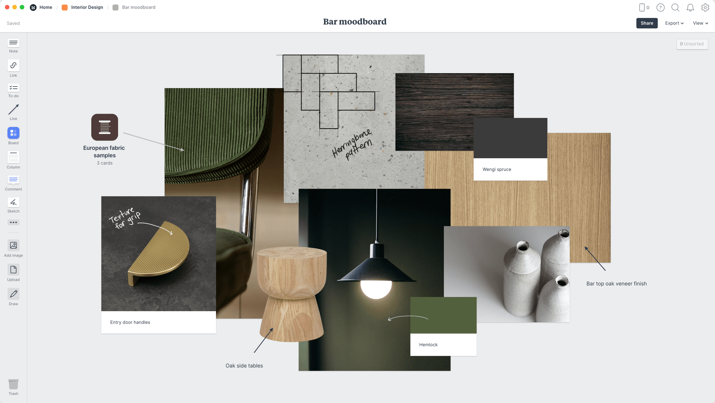
Methods for Creating Moodboards: Analog vs. Digital Approaches
Moodboards serve as visual and conceptual frameworks for projects, bridging abstract ideas with tangible elements. The choice between analog and digital creation methods depends on project requirements, team collaboration needs, and the desired level of customization. Analog methods emphasize tactile engagement and spontaneity, while digital tools offer scalability, interactivity, and real-time sharing. Each approach presents distinct advantages and limitations, influencing workflow efficiency, accessibility, and creative exploration.The selection of a method also impacts how stakeholders—whether clients, designers, or developers—interact with the moodboard. Analog moodboards foster immediate, intuitive feedback through physical manipulation, whereas digital moodboards enable remote collaboration, version control, and integration with other project tools. Understanding these methods allows creators to optimize their process based on project scope, budget, and stakeholder accessibility.
Comparison of Analog and Digital Moodboard Creation
Analog and digital moodboard creation methods differ fundamentally in their execution, tools, and outcomes. Analog methods rely on physical materials and manual assembly, while digital approaches leverage software and cloud-based platforms. Below is a comparative analysis of their key attributes:| Attribute | Analog Method | Digital Method |
|---|---|---|
| Accessibility |
|
|
| Collaboration |
|
|
| Customization |
|
|
| Cost and Tools |
|
|
| Use Cases |
|
|
blockquote> The choice between analog and digital methods should align with the project’s collaborative needs, budget, and long-term utility. Analog moodboards excel in hands-on creativity and immediate feedback, while digital tools prioritize scalability, interactivity, and remote accessibility.
Step-by-Step Guide to Assembling a Physical Moodboard
Physical moodboards leverage tactile materials to convey visual and conceptual themes. The process involves selecting, arranging, and refining elements to create a cohesive composition. Below is a structured approach to assembling an analog moodboard, emphasizing organization and clarity.Preparation Phase
To begin, gather the necessary tools and materials to ensure a smooth assembly process. Essential items include:
- Base Material: A sturdy poster board (e.g., foam board or corkboard) as the foundation. Size should accommodate the project’s scope (e.g., A3 for detailed work, A2 for broader themes).
- Source Materials:
- Printed magazines, catalogs, or books for images, textures, and typography.
- Personal photographs or printed digital assets (e.g., screenshots, sketches).
- Fabric swatches, paint chips, or physical samples for tactile elements.
- Cutting and Adhesive Tools:
- Sharp scissors or a craft knife for precise cuts.
- Glue sticks, double-sided tape, or liquid glue for secure attachment.
- Washi tape or decorative borders to frame sections.
- Organizational Aids:
- Rulers or grid templates for alignment.
- Markers or colored pencils for annotations.
- Clips or magnets to temporarily hold elements during layout planning.
Before assembling, establish a clear theme or objective for the moodboard. This ensures all selected elements align with the project’s goals. Organize the board into distinct sections based on thematic categories (e.g., "Color Palette," "Typography," "Imagery," "Textures"). Use washi tape or markers to create visual dividers.
Step 2: Source and Select Materials
Collect images, textures, and references that resonate with the theme. Prioritize diversity in visual styles to avoid monotony. For example:
- Use high-contrast images for bold themes and muted tones for minimalist designs.
- Include a mix of photography, illustrations, and typography samples.
- Add physical samples (e.g., fabric, metal finishes) for tactile projects.
Place elements on the board without adhesive to experiment with layouts. Follow these techniques to avoid clutter:
- Hierarchy and Focal Points: Position the most critical elements (e.g., primary color swatches, key imagery) centrally or in a prominent section. Use size variation to emphasize importance.
- White Space Utilization: Leave breathing room between elements to prevent visual overload. Aim for a 30–50% empty space ratio for readability.
- Color and Texture Contrast: Combine elements with complementary or contrasting colors/textures to create visual interest. For instance, pair matte finishes with glossy images.
- Alignment and Grid Systems: Use a grid overlay (drawn lightly with pencil) to maintain consistency in spacing and alignment. This ensures a professional, structured appearance.
Practical Applications Across Industries
Moodboards serve as dynamic visual tools that bridge abstract concepts and tangible outcomes, enabling professionals across disciplines to align creative direction with functional execution. Their adaptability ensures relevance in sectors where aesthetics, branding, and materiality converge—from designing intimate residential spaces to crafting global marketing campaigns. Each industry leverages moodboards to distill complex ideas into cohesive visual narratives, ensuring consistency, emotional resonance, and strategic alignment.
Interior Design: Translating Client Visions into Tangible Spaces
In interior design, moodboards act as collaborative canvases where designers and clients articulate spatial intentions before material selection or construction begins. These boards synthesize emotional cues, cultural references, and technical constraints into a unified visual language, ensuring the final space reflects the client’s aspirations while adhering to practical considerations.Materials and Layouts for Residential vs. Commercial Projects
Residential moodboards prioritize personalization and emotional connection, often incorporating:
- Fabric swatches (sofas, curtains, upholstery) with tactile descriptions (e.g., "linen-textured velvet in sage green").
- Furniture sketches or 3D renderings to convey scale and silhouette (e.g., mid-century modern armchairs vs. Scandinavian minimalism).
- Architectural details (e.g., reclaimed wood accents, geometric tile patterns) paired with mood-inspiring imagery (e.g., a Tuscan villa or Scandinavian hygge lifestyle).
- Lighting moods (warm vs. cool tones) represented through photographs of existing fixtures or conceptual diagrams.
Example Layout for a Residential Moodboard:
[Top Section: Inspirational Imagery] – A collage of Pinterest-sourced spaces (e.g., a Japanese minimalist living room, a Moroccan riad).
[Middle Section: Material Palette] – Swatches of terracotta tiles, matte black hardware, and a handwoven jute rug.
[Bottom Section: Functional Zones] – Sketches of a cozy reading nook with a floor lamp and a dining area with a farmhouse table.Commercial projects, however, emphasize brand alignment, functionality, and regulatory compliance. Moodboards here may include:
- Corporate identity elements (e.g., a tech startup’s logo colors translated into wall paint or reception desk materials).
- Spatial flow diagrams to illustrate traffic patterns in retail stores or open-plan offices.
- Sustainability certifications (e.g., FSC-certified wood, low-VOC paints) alongside aesthetic samples.
- Modular furniture systems with annotated dimensions to ensure scalability.
Example Layout for a Commercial Moodboard (Hotel Lobby):
[Left Column: Brand Story] – Photography of the hotel’s target demographic (e.g., business travelers) and brand guidelines.
[Center: Material Hierarchy] – A marble reception desk sample, leather seating textures, and a custom art installation mockup.
[Right: Technical Specs] – ADA-compliant pathway sketches, acoustic panel placements, and a timeline for phased construction.Process Integration
Designers refine moodboards through iterative client feedback, using digital tools like Adobe Creative Suite or Milanote to update layouts in real time. Physical moodboards (e.g., pinned to corkboards) remain critical for tactile evaluation, especially for materials like marble or leather. The final board often serves as a reference during construction, with annotated sections specifying suppliers or installation notes.
Branding and Marketing: Defining Visual Identities Across Mediums
Moodboards in branding and marketing function as visual style guides, ensuring consistency across logos, packaging, digital ads, and physical retail spaces. They distill brand personality—whether luxurious, playful, or minimalist—into a repeatable visual system that resonates across touchpoints.Key Applications
- Logo and Icon Design: Moodboards combine typography samples, color palettes (e.g., Pantone matches), and geometric shapes to explore visual metaphors. For instance, a sustainable brand might use organic line work and earthy tones, while a tech brand opts for sleek gradients and negative space.
- Packaging Development: Textures (matte vs. glossy), structural forms (e.g., cylindrical vs. angular), and unboxing experiences are prototyped through mockups. A coffee brand’s moodboard might feature hand-drawn sketches of cup designs alongside photographs of rustic barns to evoke artisanal craftsmanship.
- Ad Campaigns: Moodboards align photography styles (e.g., high-contrast black-and-white for edgy brands), tone (e.g., whimsical vs. aspirational), and cultural references. For example, a luxury watch campaign might juxtapose vintage travel posters with close-ups of watch mechanisms to highlight heritage and precision.
Maintaining Consistency
Marketing teams use moodboards to:
- Train designers and copywriters on brand voice through visual metaphors (e.g., "Our brand feels like a sunlit library").
- Resolve discrepancies between digital and print media by testing color renditions (e.g., CMYK vs. RGB) on physical swatches.
- Archive campaign evolution, with versions dated to track shifts in creative direction (e.g., a rebrand from "bold" to "minimalist").
Example Moodboard for a Skincare Brand:
[Top: Brand Archetype] – Images of serene landscapes, spa interiors, and scientific diagrams to balance luxury and science.
[Left: Color Palette] – Soft lavender, deep teal, and cream with Pantone codes (e.g., 15-3925 for "Tranquil").
[Right: Packaging Mockups] – Sketches of apothecary-style jars, minimalist typography, and a "clean" aesthetic with no logos on primary packaging.
[Bottom: Tone of Voice] – Sample ad copy phrases like "Nourish, don’t just moisturize" alongside imagery of hands applying product.Tools and Workflows
Digital tools like Canva, Figma, or Byrd streamline collaboration, allowing stakeholders to annotate preferences (e.g., "Use font B for headlines, not A"). For physical moodboards, moodboard templates (e.g., from Etsy or specialized suppliers) provide structured layouts with sections for brand assets, competitor analysis, and consumer personas.
Fashion and Textile Design: Crafting Cohesive Collections
In fashion and textiles, moodboards serve as color and material storyboards, guiding designers from initial concept to final garment production. They integrate silhouette sketches, fabric swatches, and cultural references to create collections that evoke specific emotions or narratives.Components of a Fashion Moodboard
- Color Stories: Palettes derived from seasonal trends (e.g., Pantone’s "Color of the Year") or natural sources (e.g., "Oceanic Blues" inspired by coral reefs). Digital tools like Adobe Color generate harmonious schemes, while physical swatches ensure accurate dye matching.
- Fabric Textures: Layered samples of raw materials (e.g., silk dupioni, denim, or laser-cut leather) are arranged to showcase drape, sheen, and tactile contrast. For example, a "grunge" collection might pair distressed corduroy with metallic vinyl.
- Silhouette Sketches: Croquis (fashion figures) illustrate proposed cuts, proportions, and details (e.g., asymmetrical hemlines or puffed sleeves). These are often overlaid with fabric swatches to visualize how materials interact with form.
- Inspirational Imagery: Photographs of art movements (e.g., Art Nouveau for flowing lines), historical periods (e.g., 1920s flapper dresses), or natural phenomena (e.g., desert dunes for earthy tones).
Example Moodboard for a Sustainable Fashion Line:
[Top: Theme] – Collage of upcycled textile art, zero-waste sewing techniques, and images of organic cotton fields.
[Left: Color Palette] – Muted greens, warm browns, and soft whites with a focus on "earthy neutrals."
[Center: Fabric Swatches] – Organic linen, recycled polyester, and hand-dyed indigo denim.
[Right: Silhouette Mood] – Sketches of oversized blazers with patchwork details, flowy midi skirts, and minimalist accessories.
[Bottom: Brand Message] – Quotes like "Fashion without compromise" paired with images of ethical factories.Process in Textile Design
Textile designers use moodboards to:
- Develop print motifs by combining color palettes with patterns (e.g., a floral print in the collection’s dominant green).
- Test dye techniques (e.g., shibori for indigo) alongside swatches to ensure consistency.
- Align with production constraints, such as fabric weight limits or printing methods (digital vs. screen printing).
Digital vs. Analog in Fashion
- Digital Moodboards: Platforms like Pinterest or Milanote allow designers to curate global trends in real time, while Adobe Illustrator enables precise pattern drafting.
- Physical Moodboards:
Tips for Enhancing Creativity and Organization in Moodboard Development
Moodboards serve as dynamic canvases where creativity and structure intersect, requiring deliberate techniques to balance inspiration with clarity. Effective moodboards avoid stagnation by integrating unconventional sources, refining visual hierarchies, and fostering collaborative input—all while preserving the project’s conceptual integrity. This section explores actionable strategies to elevate moodboards from static collections to interactive, iterative tools that drive cohesive design outcomes.
Unconventional Sources for Moodboard Inspiration and Their Adaptation
Traditional moodboards often rely on digital assets, but the most distinctive themes emerge from unexpected sources that challenge visual conventions. These sources—rooted in tangible experiences—introduce texture, emotion, and cultural context that digital libraries alone cannot replicate.Key unconventional sources and their thematic applications:
-
Nature
"Nature provides palettes of organic gradients, asymmetrical compositions, and seasonal moods that translate into timeless design aesthetics."
Adaptation:- Photograph foliage patterns (e.g., ferns, moss) for texture in UI/UX interfaces or packaging.
- Use sunrise/sunset hues as a color palette foundation, then refine saturation digitally (e.g., Pantone’s "Living Coral" originated from coral reefs).
- Study architectural elements in rock formations (e.g., sedimentary layers) for geometric inspiration in product design.
-
Architecture and Urban Spaces
"Architectural details—from Brutalist concrete textures to Art Deco symmetry—offer structural and symbolic depth to moodboards."
Adaptation:- Extract material contrasts (e.g., steel vs. glass in a skyscraper lobby) to define a brand’s visual tone.
- Deconstruct street signs or graffiti fonts to create custom typography for editorial design.
- Analyze public spaces (e.g., Tokyo’s capsule hotels) for spatial efficiency insights in interior design moodboards.
-
Street Art and Graffiti
"Street art’s raw energy and cultural commentary provide bold typography, color blocking, and narrative-driven compositions."
Adaptation:- Isolate color schemes from murals (e.g., Banksy’s neon palettes) for branding projects targeting youth audiences.
- Use stencil techniques from graffiti to create scalable logos or icons.
- Study tagging styles to inform wayfinding systems in urban design projects.
-
Vintage Postcards and Ephemera
"Ephemera from the early 20th century (e.g., travel postcards, advertisements) encapsulate historical aesthetics and nostalgic charm."
Adaptation:- Digitize postcard borders and patterns for retro-inspired digital interfaces (e.g., Airbnb’s early aesthetic).
- Analyze vintage typography (e.g., Art Nouveau scripts) to revamp brand identities with period authenticity.
- Use postcard imagery of local landmarks to ground a moodboard in regional identity (e.g., Swiss tourism campaigns).
-
Everyday Objects and Food Photography
"The mundane—coffee stains, fabric textures, or food styling—reveals overlooked details that add authenticity to moodboards."
Adaptation:- Photograph food plating (e.g., molecular gastronomy) for high-end restaurant branding.
- Capture fabric weaves or leather grain close-ups for product packaging moodboards.
- Use coffee-ring effects or salt crystals as micro-texture references in material design.
To synthesize disparate sources into a unified vision:
1. Define a unifying concept (e.g., "rustic futurism" or "digital nostalgia") before selecting assets.
2. Apply a consistent filter—e.g., desaturate all images to 70% opacity to create a monochromatic underlay.
3. Map elements to design principles:Source Design Principle Example Application Nature Asymmetry Organic shapes in app icon design Architecture Contrast High-contrast typography in editorial layouts Street Art Hierarchy Layered compositions in poster design Techniques for Refining Moodboards to Avoid Visual Overload
Visual clutter undermines a moodboard’s ability to communicate intent clearly. Strategic refinement ensures the board remains a tool for focus, not distraction. Overload often stems from an excess of colors, competing textures, or unbalanced focal points—all of which can be mitigated through systematic constraints.Core strategies for clarity and cohesion:
-
Limiting Color Palettes
"A palette of 3–5 dominant hues (including neutrals) prevents chromatic chaos while maintaining versatility."
Implementation:- Use tools like Adobe Color or Coolors to extract palettes from moodboard assets, then limit selections to:
- 1 primary color (e.g., brand blue).
- 2 secondary colors (e.g., accent teal + warm orange).
- 2 neutrals (e.g., off-white + charcoal).
- Apply the 60-30-10 rule to digital moodboards: 60% dominant, 30% secondary, 10% accent.
- Test palettes in grayscale to identify which colors carry the most weight.
- Use tools like Adobe Color or Coolors to extract palettes from moodboard assets, then limit selections to:
-
Structural Organization with Grids and Templates
"Grids impose order without rigidity, guiding the viewer’s eye through intentional sequences."
Implementation:- Adopt a modular grid (e.g., 3x3 or 4x4) to distribute elements evenly. Tools like Canva or Figma offer pre-built templates.
- Use visual hierarchies by:
- Placing the strongest focal point (e.g., a product mockup) in the golden ratio zone (top-left quadrant).
- Grouping related elements (e.g., typography samples) in columns.
- For analog moodboards, sketch a light pencil grid before pasting to maintain alignment.
-
Prioritizing Focal Points
"A moodboard should have 1–2 dominant elements that anchor the theme, with supporting assets enhancing—not competing with—them."
Implementation:- Identify the core message of the moodboard (e.g., "luxury minimalism") and select 1–2 images that embody it visually.
- Apply the rule of thirds to composition: Divide the board into nine equal parts and place key elements along the lines or intersections.
- Use negative space to isolate focal points (e.g., a single product photo on a white background).
- For digital moodboards, reduce opacity of secondary elements to 50–70% to create depth.
-
Iterative Pruning
"The most effective moodboards evolve through subtraction, not addition."
Implementation:- Conduct a "kill your darlings" review: Remove any element that doesn’t directly support the theme after 48 hours.
- Ask: *"Does this asset add meaning
A moodboard is more than a collection of images—it is a living document that evolves alongside a project, refining ideas through iterative feedback and deliberate curation. Whether used to define a brand’s identity, sketch a fashion collection, or plan a commercial space, its power lies in its ability to communicate intent without ambiguity. By mastering its elements—color harmony, typographic hierarchy, and visual balance—creatives can transform abstract concepts into tangible strategies. The most effective moodboards do not merely inspire; they clarify, unify, and propel projects forward, proving that the right visual language can turn visionary ideas into reality.
Leave a Comment
Comments are moderated before appearing. The data you submit is processed according to the Privacy Policy of www.linuxunplugged.com.